
In the push for meaningful metrics, an abundance of data can overwhelm even the most statistics-savvy professional. But when you learn how to transform data into a story, you can make an impact on your audience and move them to action—in just one telling.
Data can be overwhelming. It’s often delivered to executives as an incomprehensible wall of statistics via a complex spreadsheet or a lengthy deck of poorly conceived charts and graphs.
But data doesn’t have to be this confusing.
With data storytelling, you can create a straightforward, compelling narrative based on complex data to influence and inform your audience.
Learning how to create an effective story helps you stop inundating your audience with facts and figures (to no avail) and instead present a narrative that resonates with people, builds understanding, and gets you buy-in to move forward.
How to Transform Data into a Story
Data storytelling shows a meaningful and clear relationship between data and the reality it represents—and it helps people quickly understand how the data relates to a goal or a strategy so they can take action to reach that goal or implement that strategy.
If you’ve ever been in a presentation where a cluttered slide full of words and supply chain images and 50 types of clip art is used to explain an upcoming organizational change, you’ll understand the dilemma of too much data. Data storytelling elegantly quiets the chaos of too much data and instead presents a simplified version of the facts—a simple metaphor or image—that people can understand and get on board with.
Over the last two decades, XPLANE has developed a storytelling framework that helps clients turn complex data into stories that are at the right level and have the right narrative arc for the audience to clearly understand what’s being conveyed—and how they can respond.
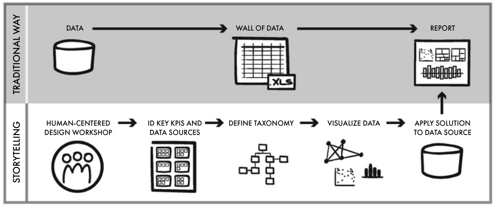
There are four steps to the process.
Step 1. Consider your audience
Great data stories are more than myriad data sliced and diced a dozen ways. Composing data stories requires restraint and alignment on selecting and showing only the data that supports audience needs.
The key to crafting the right story doesn’t start with the data; it starts with users and a people-centered design process.
To design a story for your particular audience, you’ll want to consider the following questions:
- Who is my audience?
- How will they use the data?
- What are their goals?
- What are their priorities?
Understanding your audience helps you home in on the key performance indicators (KPIs) and data points that will support your narrative.
Step 2. Design your story with the audience in mind
Good data storytelling then follows a fairly simple narrative arc: setting the stage, establishing the tension or the challenge, and then bringing a resolution. You’ll want to keep in mind your understanding of your audience and focus on three key questions:
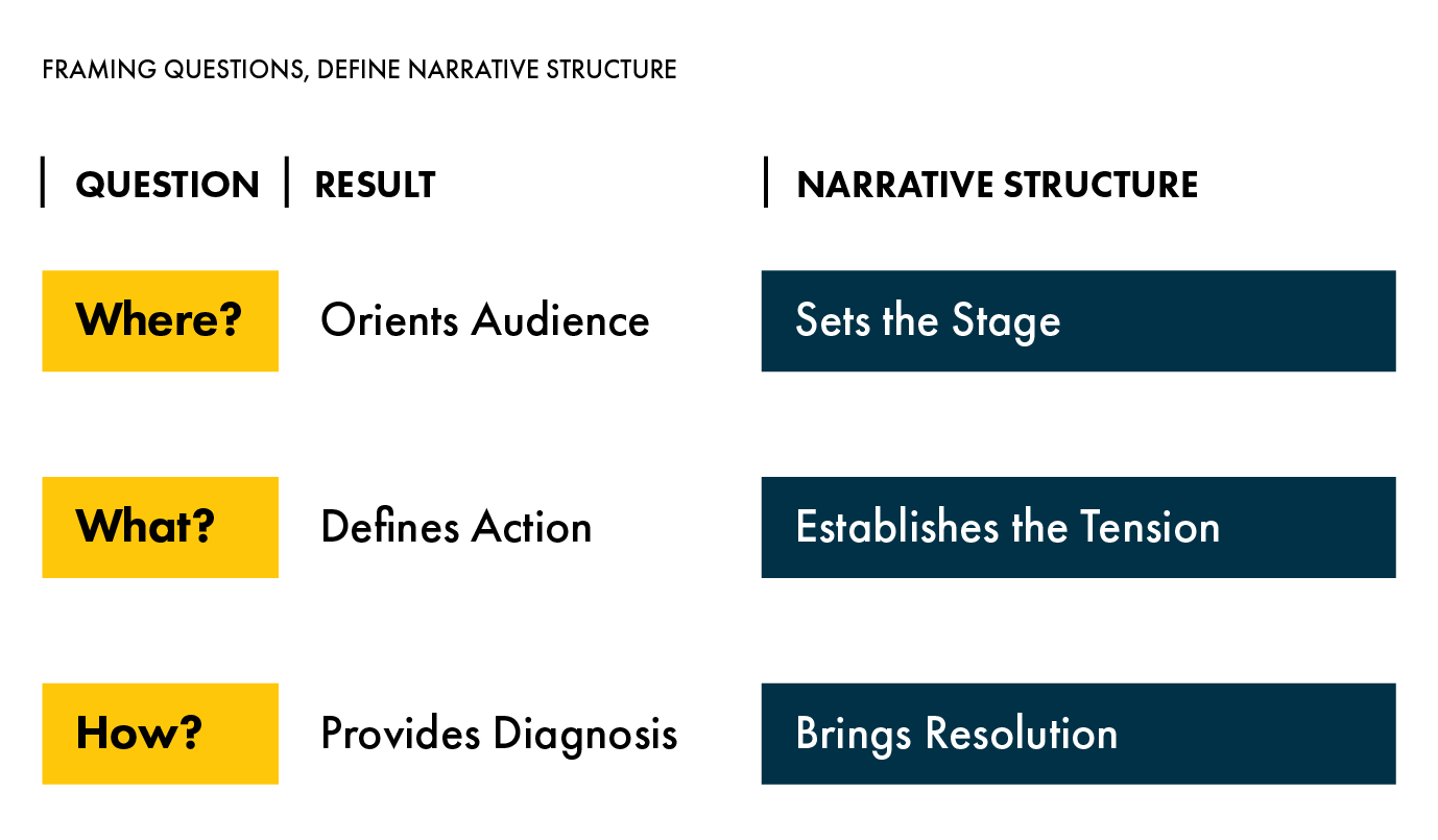
- Where does the audience need to focus? This is the starting point that sets the stage for your story. It should help people quickly see the landscape or the scene where they are beginning.
- What do they need to do? Define the action. What do people need to act on? What are opportunities and challenges for them? What is the pressing problem?
- How do they do it? This is the diagnosis, or resolution. It looks to the data to find a solution and resolve the challenge.
Once you answer these questions, you have the elements of your story and a clear sense of the business objectives that drive decision-making.
The next challenge is to approach the design in a way that clearly represents the narrative driving the data story and allows users to quickly and intuitively make the right decisions.
Step 3. Identify and group data based on audience needs
At XPLANE, we design data stories by first looking at how to group the data. So often in large organizations, managers develop their own reports using different data sources and methodologies. This often results in a set of reports that can’t roll up into a cross-organizational view that is useful for an executive.
To develop a common language, we ask our clients to identify what data story would be useful. By framing things this way, it frees up their thinking, gets them away from the columns and rows in the spreadsheet, and helps them conceptualize how the data might relate to the broader business objective. From here, we then select KPIs and groupings of data that support that objective.
Once we have a sense of elements that make up the common language, we focus on taxonomy.
Taxonomy means understanding relationships and hierarchy of information and putting data into information categories. For this to be successful, we again have to rely on understanding users.
Different users in different roles will need to see data at different levels of granularity. We need to know how and when different people use the data so we can organize it with fidelity to support their needs.
For example, an executive might only need a few key data points to know whether the new strategy is working, but a CFO might want to know what aspects of the strategy are going well and what action needs to be taken to affect the outcome.
Step 4. Visualize your data story
Finally, we think about how we represent the data on the page.
What’s the right chart or graph to express the data? While a scatter plot, for instance, might be a great way to a see distribution across a few dimensions, it’s not the best way to view trends over time.
In addition, you’ll want to consider the use of color and space in your visuals. Which colors will elicit the reactions you want to elicit? An abundance of warm colors on a page might create alarm even when that’s not the intent. A page with too much information or too many things going on might create confusion about what to focus on.
Finally, don’t forget to consider font and labeling to establish the proper relationship among elements and provide clarity and context where needed.
Practice makes perfect
By following these steps, you have the foundation for creating data stories that make sense of critical data and cause people to pause, seek to understand, and care about the information you are sharing.
Over time and with practice, you’ll become a more adept data storyteller capable of forwarding your goals in a fun, informative, and influential way.
Master the art of storytelling
Would you like to delve deeper into the elements of storytelling and learn to create stories that resonate with your audience and inspire action?
Register for our Storytelling for Change course to master the art and science of telling stories that inspire others to confidently support and act on your goals.
Additional Resources
For more storytelling tips and tricks, we recommend these blog posts: