Though there are creative people in finance, I am not one of them.
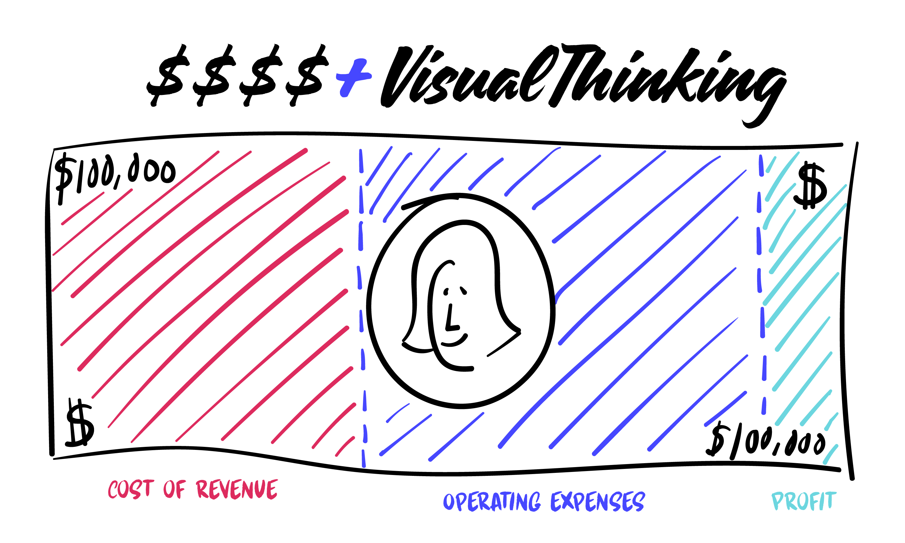
Despite this, I recently pushed aside my fears by mentioning to a (admittedly much more creative) coworker that I wanted to use visuals at our all-employee meeting. As the company Controller, my idea was to present financial information in a more interesting way to help employees better understand the company’s profit and loss activity—and to spare them yet another grid or graph of numbers.
My First Experience with Visual Thinking
My coworker was glad to help, suggesting that we schedule a mini visual thinking session. On the appointed day, the session began with my introduction to classic visual thinking tools—a whiteboard, post-its, and lots of sharpies.
Immediately, I was horrified at the thought of having to draw something. My concerns were quickly relieved when my coworker began to walk me through the visual thinking process.
Visual thinking, if you’re unfamiliar with the concept, helps people organize their thoughts and improve their ability to think and communicate. It’s a language with a unique alphabet, words, grammar, and style that taps into visualization, our most powerful capability for understanding.
Visual thinking is a great way to convey complex or potentially confusing information—like financial information.
So our first step was to identify and understand the components of a simple profit and loss. On a whiteboard we identified the big buckets of a profit and loss, sectioning off the whiteboard into three parts—with one section for each “bucket.”
 We then identified components of each bucket and categorized them accordingly. Drawing from visual thinking methodology, we used the comparison visual framework (examples to the left), which shows differences or commonalities between two or more states. This helped us further visualize components of operating expenses, since that bucket includes sub-buckets.
From there, we created a four-quadrant grid showing four operating expense sub-buckets: (1) people, which represent wages and benefits, (2) business, which represents business growth-related expenses such as marketing, (3) fixed expenses such as rent, and (4) variable expenses, such as internal project contractors.
 We also used the processes visual framework, which shows information in a defined sequence, to map the flow of money in a profit-and-loss starting as revenue, then as cost of selling, and the four types of overhead. Unfortunately, this map did not make too much sense, but it could work for cash flow.
The Power of Visual Thinking
Creativity, let alone the concept of visual thinking, is not part of my everyday life. But my foray into visual thinking enabled me to experience the power of this methodology even in a limited capacity.
Visual thinking helped me think in shapes, images, and color rather than just words. Separating profit and loss into buckets and seeing it in a non-linear format helped me visualize profit and loss horizontally rather than the traditional vertical format.
In the end, my coworker and I came up with the following visual to show budget versus actual for a full profit and loss. The visual worked well, especially when the actual is placed above or below the budget. Next up is visualizing cash flow. If we ever figure that one out, we are happy to share!!

 After experiencing Visual Thinking, I agree that it promotes shared understanding by transforming ambiguous terminology into something tangible. Visual Thinking organizes your thoughts and improves your ability to think and communicate—and it’s achievable even for “non-creative” people like me.
Want to get started on your journey to visual thinking and better communication? Check out our visual thinking blog posts.
If you want to take it a step further, then join us for our Portland Visual Thinking Boot Camp in the fall, which I will be attending. Perhaps we can create that cash flow visual together….
