“Keep it simple.” This common principle of design drove our creative team into a debate last week.
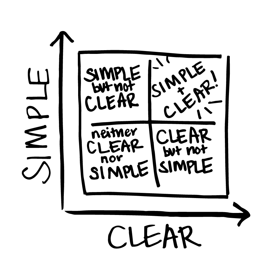
What does simple mean? Does everything we design really need to be simple? Or does it just need to be clear? And what is the difference between simple and clear? This idea of “simple” was an important design principle to follow, but on its own it can lead designers in the wrong direction.
Information design seeks to balance visual simplicity with clarity. Information designers have to take into account both the information that is displayed and the information that is implied. Are we telling the right story in way that is as concise as necessary – and possible? Did we inadvertently change the meaning by deleting too much information? Is it too simple and no longer clear?
Here at XPLANE, our designers constantly have to find this balance between simplicity and clarity. In our work we often create what we call XPLANATiONS—detailed, illustrated maps that clearly convey a complex set of information. Though the visual solution is simplified from the original chaos of the source material, the XPLANATiONS often turn out to be very complex. The final product may not be simple, but the meaning is now clear. We consider that success.

So, we have come to our own definition of the term simple. Simple means having a deep understanding of the information you are trying to convey and focusing on how to display that information as clearly as possible. This clarity helps bring simplicity to the user’s experience and improves understanding. The two ideas should constantly work together, but one does not cause the other. Instead, they can function both separately and together.